Tsuyu Nails

Tsuyu Nails: brand identity for custom nails

In 2025 we developed a distinct, dreamy brand for Tsuyu Nails: a logo with a cloud and stars in sky blue, plus a business card, two instruction cards and stickers. Everything is designed to work in a small Instagram profile picture just as well as on paper.

Client
Tsuyu Nails
Year
2025
In short
Logo, business card, instruction cards and stickers for Tsuyu Nails, the custom nail label of the artist who is also behind Takomille.

01

Starting point

Tsuyu Nails and Takomille belong to the same artist: as Takomille she draws and takes commissions for creative projects, as Tsuyu Nails she designs custom nails. She presents both on Instagram. After the Takomille logo it was Tsuyu Nails’ turn, as a brand in its own right that works in a tiny profile picture as well as on cards and stickers.

02

Decisions

  1. The dream in the name

    Tsuyu shortens a Japanese phrase: “tsume no yume”, the dream of nails. “Tsu” and “yu” became the brand name, and dream nails are exactly what the artist makes. The logo had to convey that feeling instantly without tipping into kitsch.

  2. Cloud and stars

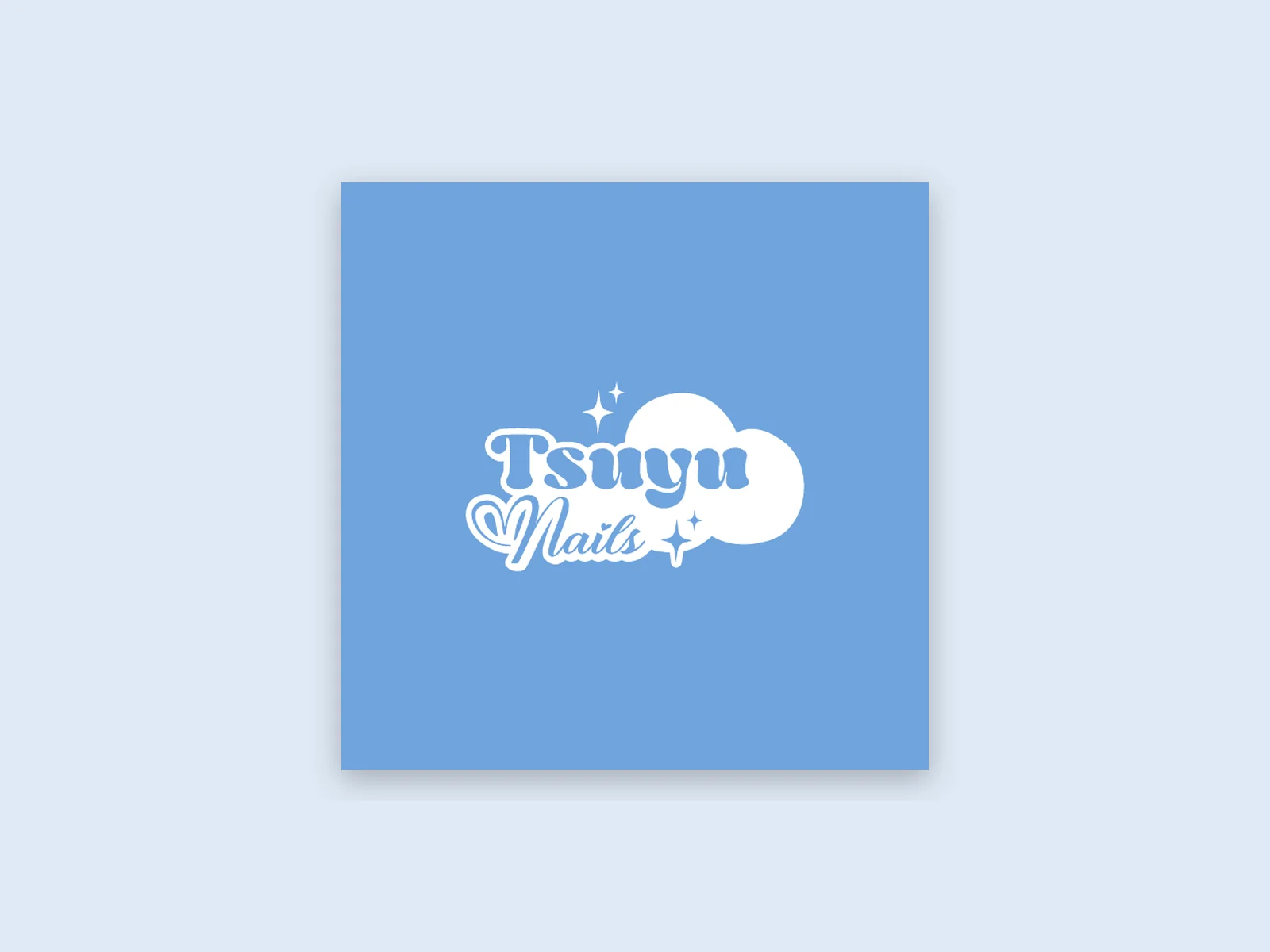
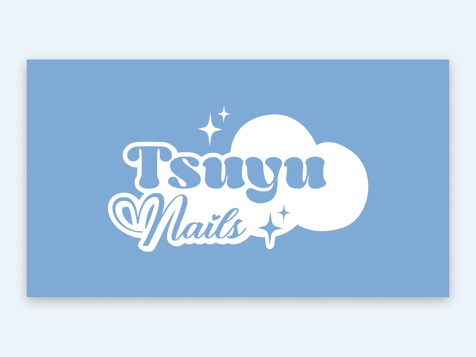
    The lettering sits on a soft cloud with small stars twinkling around it. Together with the light sky blue it creates the airy, dreamy mood that suits the nails.

  3. Playful and elegant at once

    “Tsuyu” is set in a thick, rounded typeface that feels friendly and playful, with “Nails” running beneath in an elegant script with a small heart. The contrast keeps the logo lively yet refined.

  4. Designed from the profile picture up

    We set up the logo to stay legible at a tiny size on Instagram and to make an impact large on paper. That is why there are versions in blue, on black and entirely in black.

03

Result

Tsuyu Nails now has a dreamy presence of its own, clearly the artist’s work and still with its own identity. Logo, business card, instruction cards and stickers speak the same language as the Instagram profile, from the first impression in the feed to the card in your hand when you unpack.

One look from feed to packaging.
Glance → click → customer

The performance angle

For performance this is the groundwork: if you want to win attention in the feed, you need a mark that stays recognisable at the smallest size and a look that runs through every touchpoint. That builds recognition before the first ad runs.

The process

  1. The logo

    Two typefaces, a cloud, a few stars. The logo exists on sky blue, on black and in a single colour, for stamps, foil or very small formats.

    • Tsuyu Nails logo in white on sky blue
      On sky blue
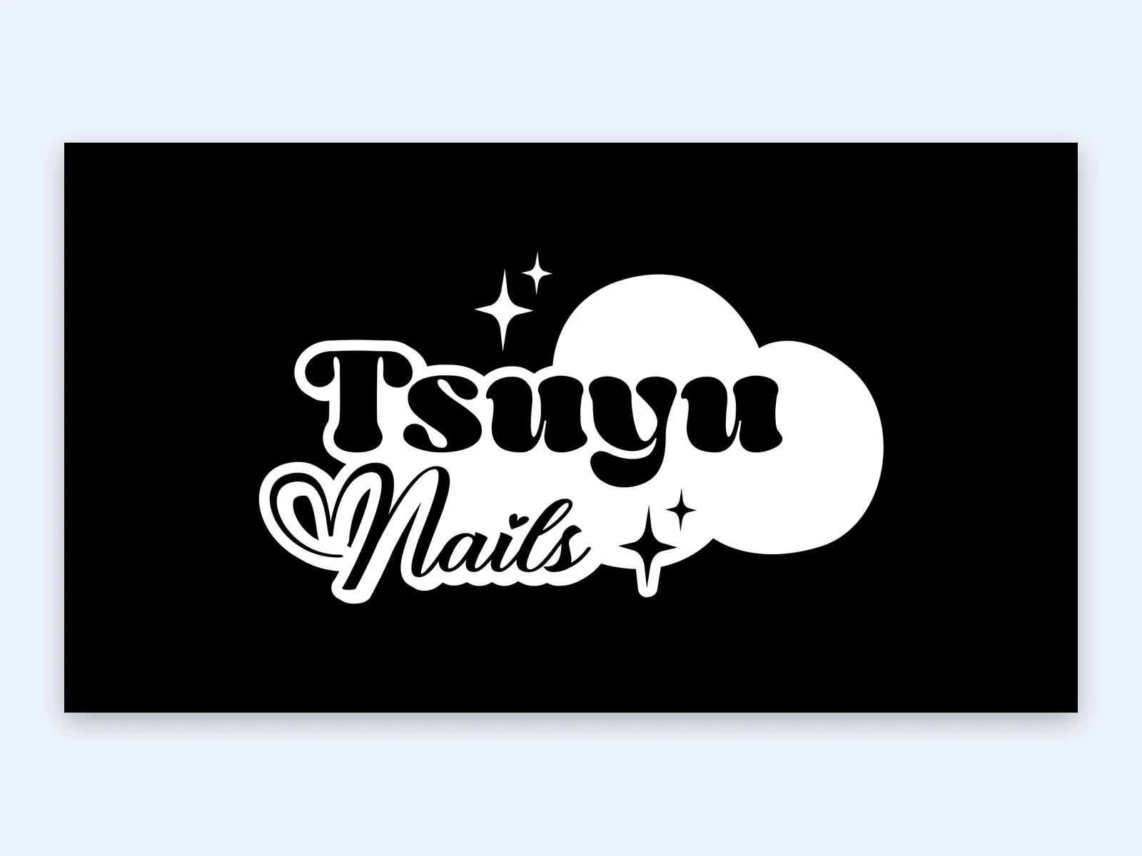
    • Tsuyu Nails logo on black
      On black
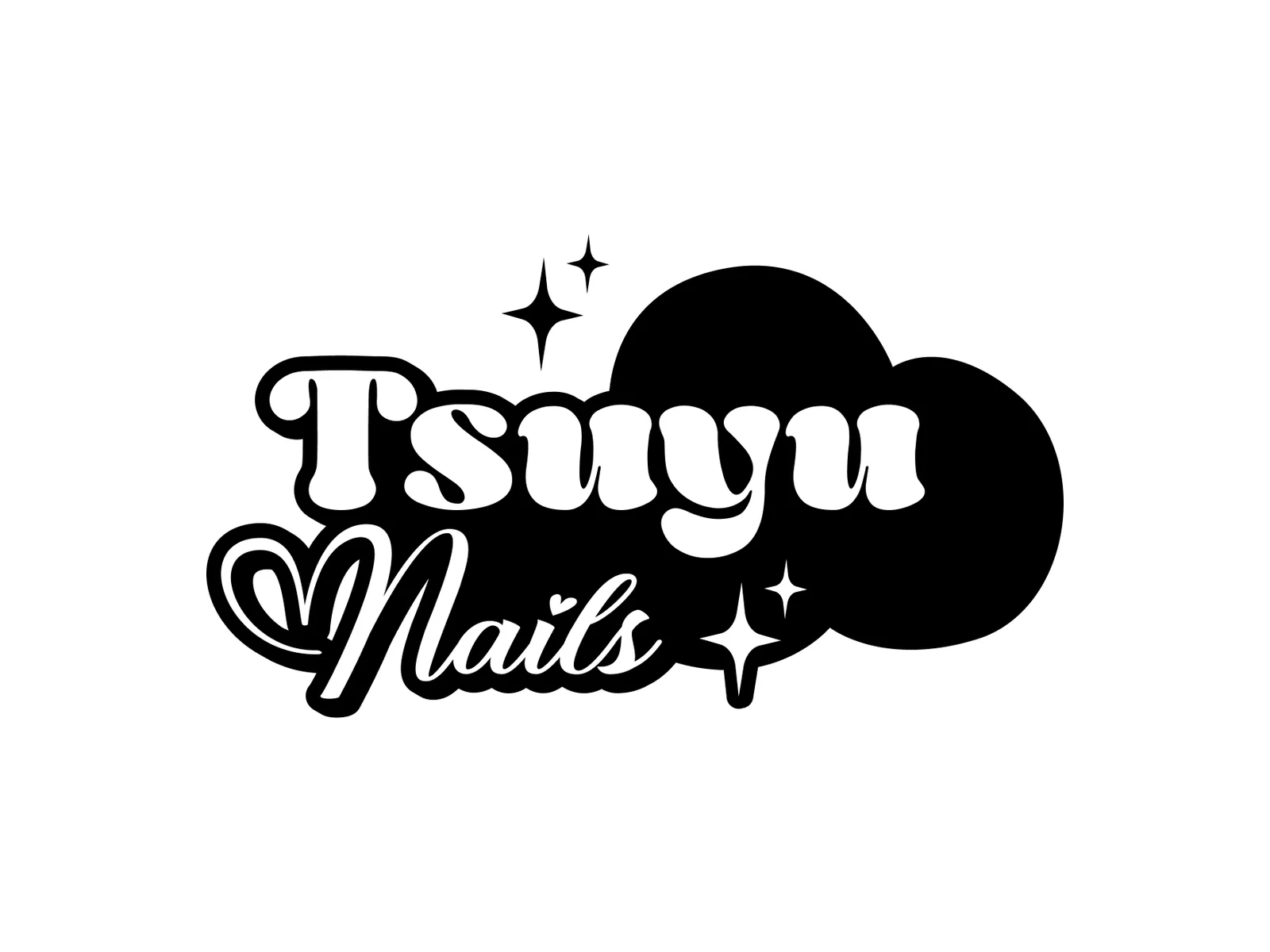
    • Tsuyu Nails logo in black
      Single colour
  2. The corporate identity

    Light sky blue and lots of white, like a sky full of clouds. We only use black where contrast is needed.

    • Sky blue#80A9D7
    • White#FFFFFF
    • Black#000000
  3. Business card

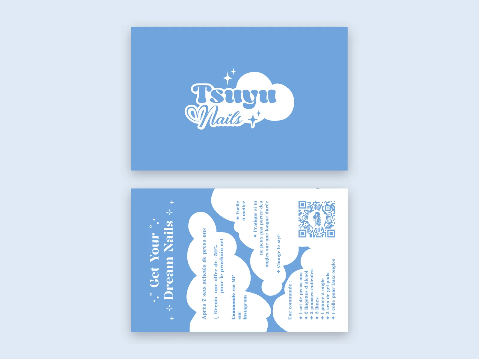
    Front: logo on blue. Back: clouds, the slogan “Get Your Dream Nails” and a QR code that leads straight to the channels.

    • Tsuyu Nails business card, front and back
      Front and back
  4. Instruction cards

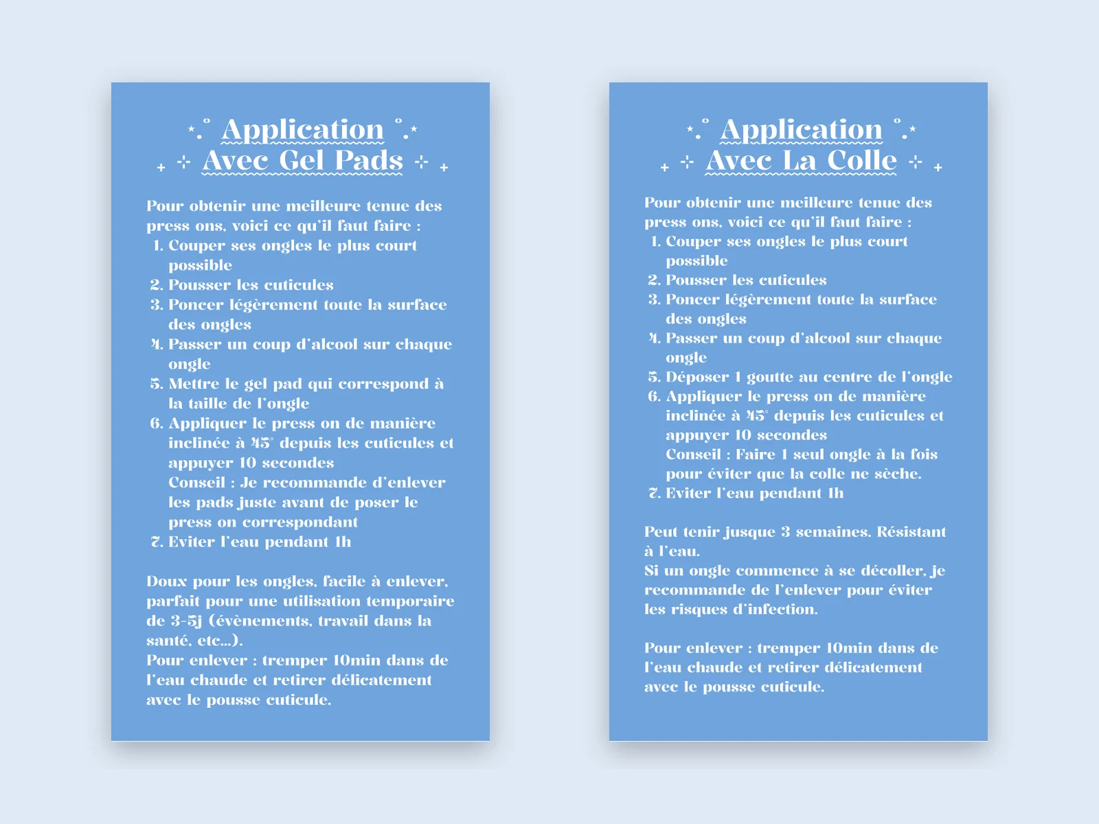
    To make the nails last, two cards in the same design come with each order: a step-by-step guide for gel pads and one for glue.

    • Two Tsuyu Nails instruction cards for gel pads and glue
      Gel pads and glue
  5. Sticker and convention banner

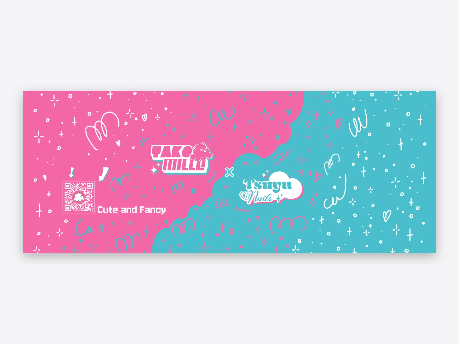
    A sticker for packaging and orders. At conventions Takomille and Tsuyu Nails appear side by side, and the banner links both brands: pink meets blue.

    • Tsuyu Nails sticker
      Sticker
    • Shared convention banner for Takomille and Tsuyu Nails
      Banner Takomille x Tsuyu Nails

Services for similar projects

More cases

All cases

Let’s take a look.

15 minutes, free, no pitch deck. We look at your setup and tell you honestly where the biggest potential is.

Book a free callFree checkPrefer talking? Call us or send a WhatsApp. +49 163 1695917 · WhatsAppor email us at hello@wiro.design
Free check