01
Starting point
Under the name Takomille, an illustrator shows her work on Instagram and at conventions and takes commissions for all sorts of creative projects. At a convention a quick glance in passing decides whether someone stops. She needed a logo with as much character as her drawings.
02
Decisions
Eight arms in the name
Takomille plays on the octopus, “tako” in Japanese. The artist had already drawn a little octopus of her own for this pun.
Her octopus becomes the logo
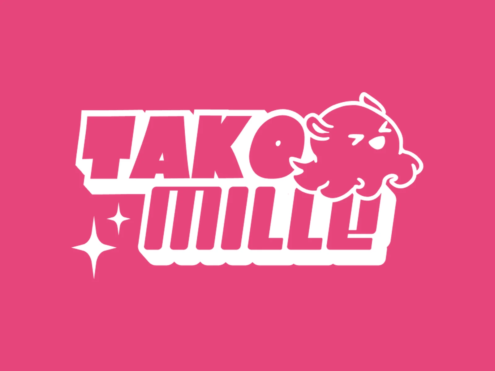
The little octopus is so cute and has so much character that we brought it straight into the logo. It winks, looks cheeky and perches on the lettering as if keeping watch. That way her own hand is part of the mark.
Y2K instead of polished
Chunky offset block letters, sparkle stars and shades from pink to berry: the logo picks up the Y2K style that suits her art and her audience. Loud enough for a packed convention hall, yet still legible in a profile picture.
One system for booth and feed
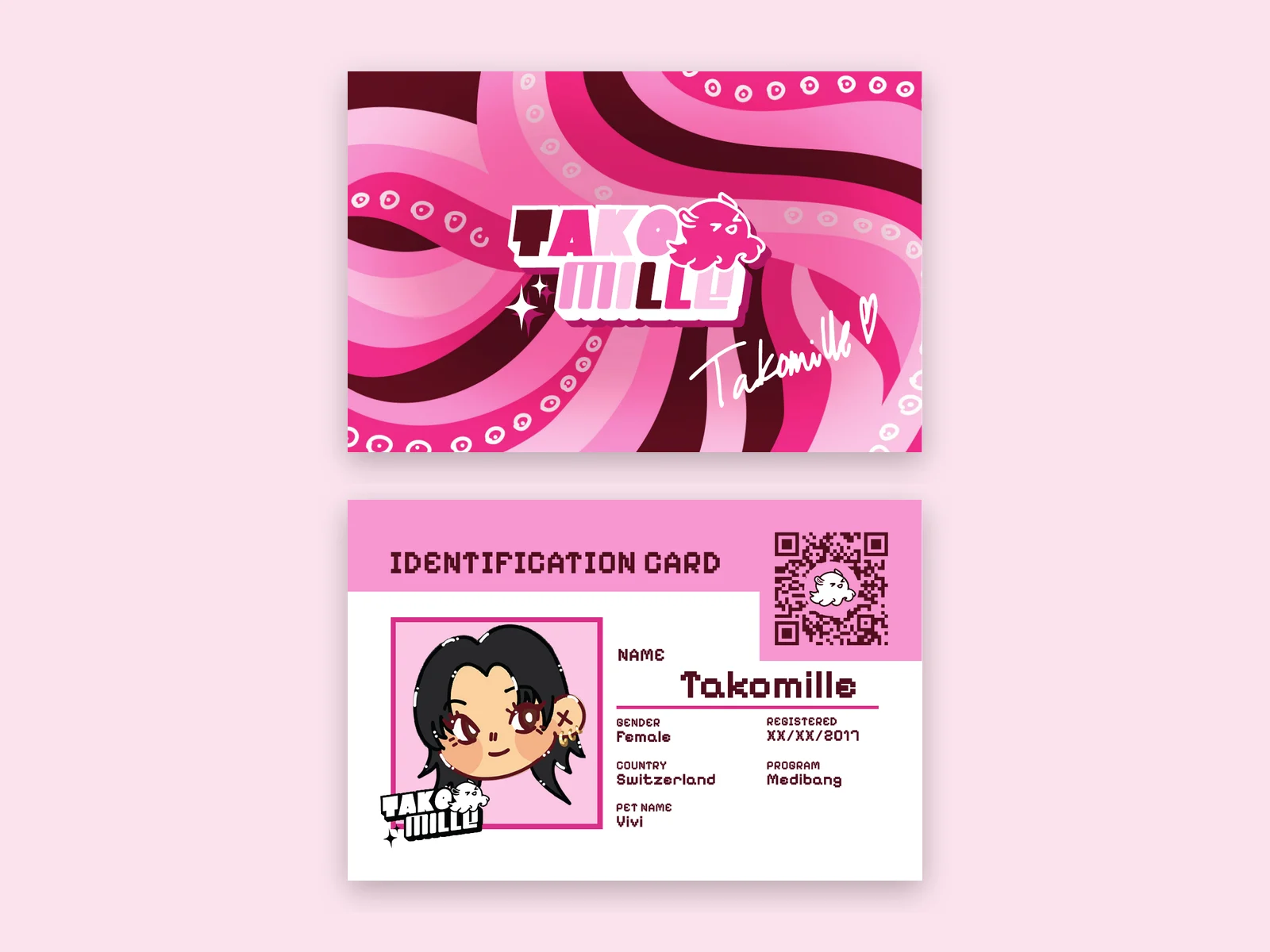
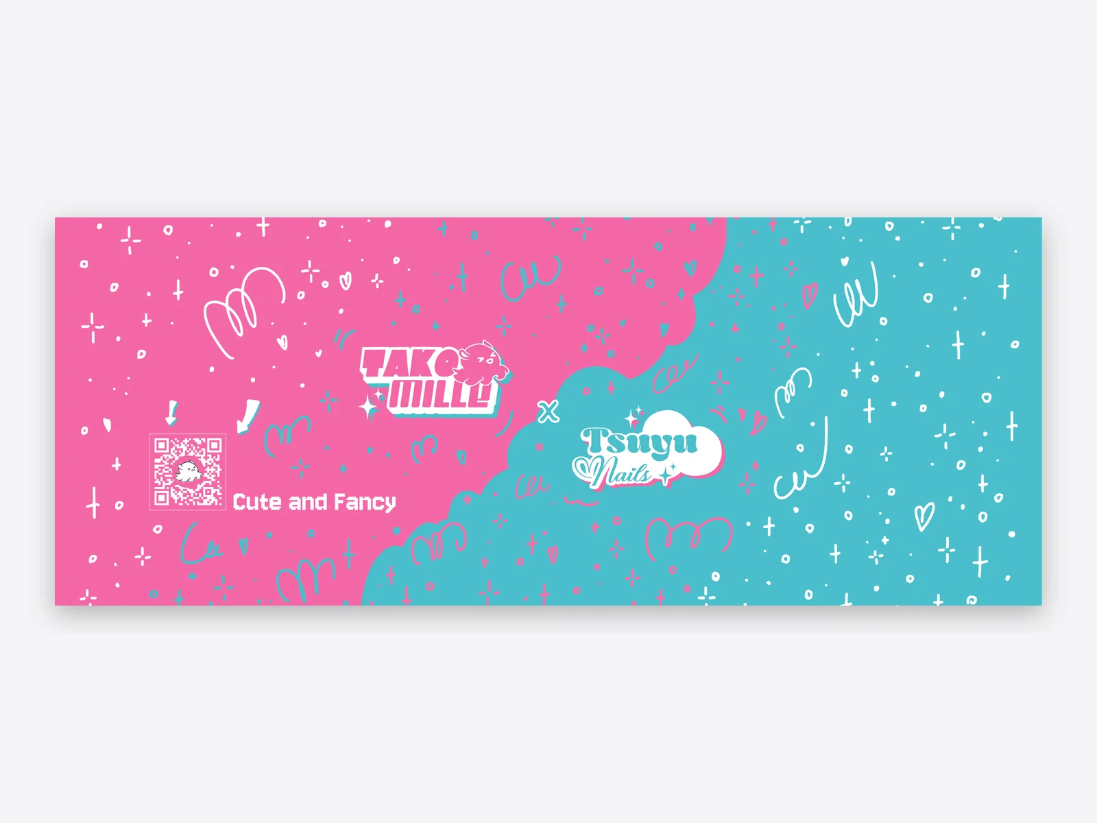
Logo, business card, stickers and banner are aligned so the brand feels the same at the booth and on Instagram. Afterwards we moved on to her second brand, Tsuyu Nails.
03
Result
Takomille now has a logo as playful as her art and a presence that holds together from the feed to the convention table. The little octopus is the face of the brand: on the sticker, on the business card and large on the banner that draws visitors to the booth.
A logo with character, from sticker to banner.