01
Starting point
Etranges Ailleurs loosely means “strange elsewheres”. Behind it are two artists from France with a clear idea: a brand that opens up curious and fascinating worlds to visitors through art. Before we could design anything, the idea needed an image people grasp straight away.
02
Decisions
The brand as a gateway
Etranges Ailleurs is neither a shop nor a classic gallery but a crossing into other worlds. So the logo had to do more than carry a name: it had to promise a journey.
A ship casts off
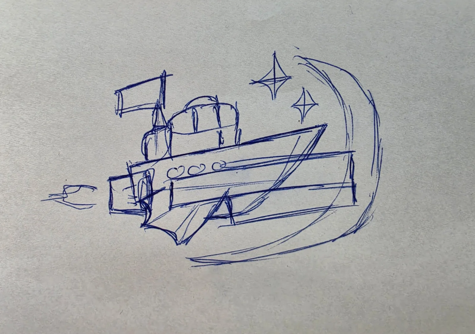
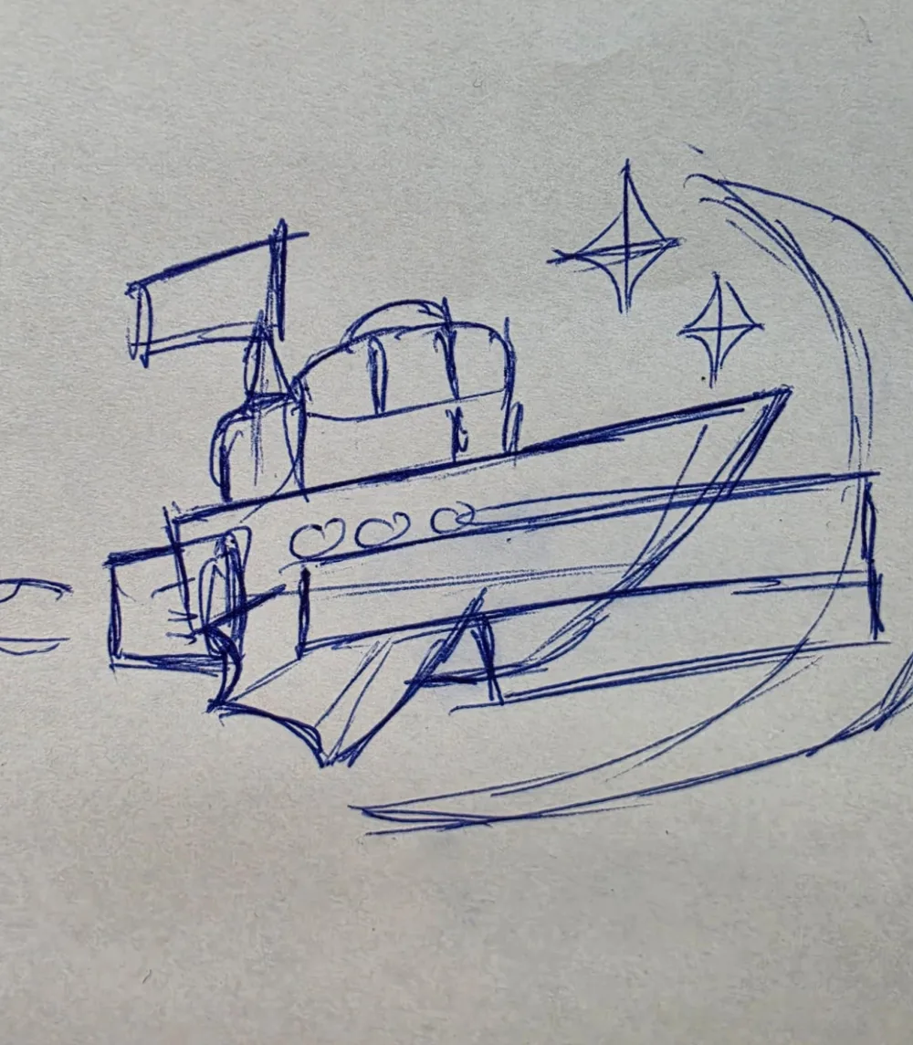
The first sketch shows a ship with a flag, a funnel and portholes sailing out of a large crescent moon, with stars twinkling around it. The ship stands for the journey, the crescent for the gateway to a strange elsewhere and the stars for the wonder that awaits visitors there.
Idea first, form second
We deliberately started with a pen, not software. A sketch shows whether an idea holds before type, colours and lines are fixed.
03
Result
The vision has become an image people understand instantly: a ship setting out into strange worlds. We are currently building the Etranges Ailleurs branding and corporate identity on this concept. A website is planned as the next step, and this case will grow with the project.
We are glad to have found a professional with a fresh, creative mind who personally takes the time to understand and solve our problem and our needs.