01
Starting point
Sektor29 sets up mobile gel blaster arenas and is the official Gel Blaster partner in Germany. The founders see it as the better alternative to paintball and laser tag: the gel pellets cause no pain, leave no stains, break down by themselves and do not harm the environment. Games can happen anywhere, from company parties and stag or hen dos to birthdays and public events. Only the old logo looked dated and said nothing about this idea.
02
Decisions
The arena provides the mark
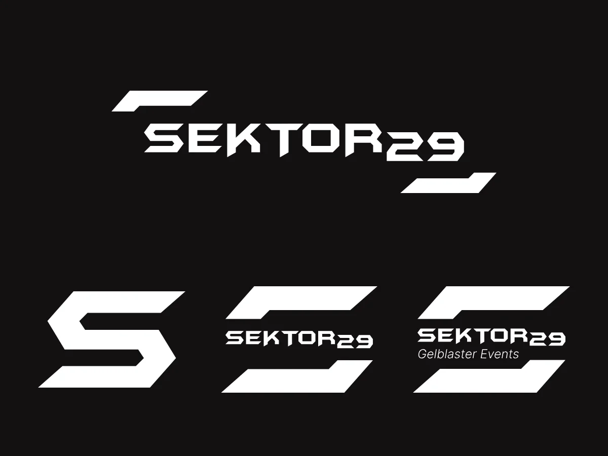
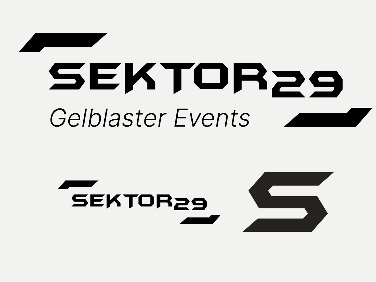
The arena is filled with hexagon-shaped obstacles. That gave us the core idea: a mark for space and cover. Since Sektor29 plans other event formats in the long run, we framed the concept more broadly, as space, event and area. That way the logo carries formats beyond gel blasters as well.
A hexagon in the wordmark
The wordmark picks up the six-sided shape, with the slogan beside it in calm, clean lettering. On the website an angular display typeface handles navigation and buttons, while headlines and body copy are set in Inter because it stays legible even at small sizes.
Neon for a gaming crowd
The founders had gaming and RGB setups in mind, and those are exactly the people the brand should reach. So red and green became extremely bright neon tones: green like the gel pellets that glow in the dark, red like the obstacles. Black forms the stage, much of the website runs in dark mode, and the colours read like light in the arena.
Motion on every channel
The redesign in late 2024 was followed by the website in 2025: tidy, but with plenty of micro-animations and micro-interactions that keep visitors on the page. In parallel we built logo animations for social media, web and campaigns and produced and edited content for Sektor29. Shop and blog were added later as an extension.
A hero that pulls you into the game
A field of green dots floats over the dark homepage background: gel pellets in flight. As you scroll, the layer slowly zooms closer, as if you were stepping into the arena yourself. At the same time the action video in front shrinks slightly and the headline slides down. That builds depth and pace without making the page feel restless.
03
Result
The dated logo gave way to a brand that looks like arena, neon and action. Logo, CI, animations, website, shop and blog form one system, from the post in the feed to the booking enquiry. Today Sektor29 comes across the way the events feel to its founders: fast, loud in the best way and recognisable at a glance. The website is live and brings in client enquiries continuously.
One system, from the logo to the shop.
Our brand was not just redesigned, it was rethought. That made the difference.